Make It Obvious How to Listen to Your Internet Radio Station
Your Internet Radio Station website should make it instantly clear how visitors can start listening. If someone lands on your page and cannot find a “Listen Now” button within seconds, you risk losing them entirely. A clear, visible listening option not only serves your existing audience but can also convert curious visitors into loyal listeners.
Why Visibility Matters
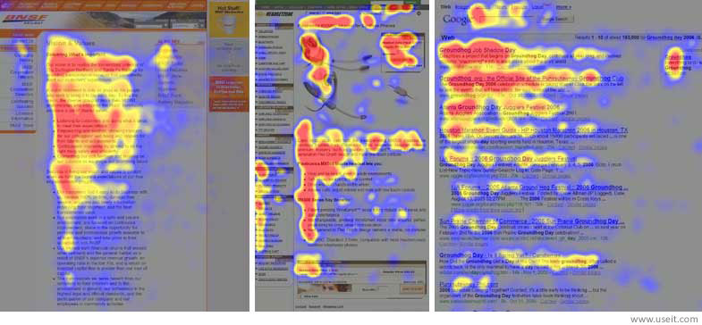
Most people do not read full web pages. Studies have shown that, on average, visitors read only about 28% of the text. Eye-tracking research also reveals that people scan content in an F-shaped pattern: two horizontal glances followed by a vertical scan down the left side. Therefore, keeping the Internet Radio Station’s listening options where the eye naturally lands is crucial.
The most effective placement is in the top left or top center of the page. These areas are where users focus first, which is why your navigation menu should be at the top horizontally or on the left vertically.
A similar study called this the golden triangle.
Placing Your “Listen” Button
The button should stand out from the rest of your site’s design by using a bold, contrasting color. The text should be direct and action-oriented, such as “Listen Live,” “Play Now,” or “Start Listening.” Avoid vague labels like “Go” or “Here,” which do not communicate the action clearly. For your Internet Radio Station, these direct commands engage listeners effectively.
Using Visual Cues to Draw Attention
Icons and graphics are highly effective at drawing attention to your listening option. Recognizable symbols, such as a play button or speaker icon, quickly signal that audio is available. When combined with an attention-grabbing button, these visual cues make it more likely that a visitor will click and start listening, amplifying the appeal of an Internet Radio Station.
In some cases, even visitors who stumble onto your site by accident may be intrigued by a clear “Listen Now” option and choose to stay, becoming new listeners in the process.

